We live in a world of Big Data, in which data visualization has become essential. This blog will guide you through data visualization definition, history, benefits, types, and best practices.
Data Visualization Explained
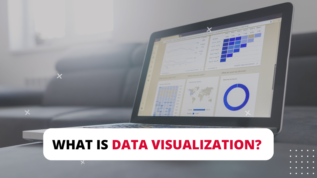
Data visualization is the presentation of information and data using visual graphics like charts, maps, infographics, plots, and animations. Essentially, it simplifies complex data by breaking it down visually. This makes it easy for you to spot and understand trends, patterns, and outliers in the data.
The History of Data Visualization
In the 17th century, the idea of using pictures was started to understand data from graphs and maps. Then, it was reinvented into a pie chart in the early 1800s. A few decades later, Charles Minard set an example of visual graphics with Napoleon’s invasion map of Russia. This map demonstrates his deep understanding of the event because it presents the army size and the path of Napoleon’s retreat from Moscow.
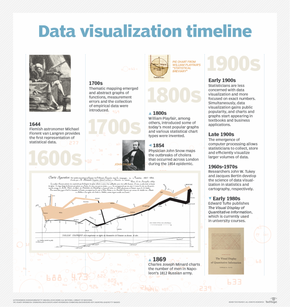
Thanks to the invention of computers that can process data at lightning speed, data visualization has evolved into a kind of art and science. Data visualization has become a critical part of analyzing and understanding data in organizations.
The Importance of Data Visualization

The main reason data visualization is essential is its ability to break down complex data sets and turn them into visual elements for human brains to process efficiently. It is a universal way to deliver complicated concepts to viewers without overwhelming them, like spreadsheets and long-text reports.
Here are several applications of data visualization in businesses:
- Point out areas for modification and improvement.
- Forecast sales volumes.
- Understand product placement.
- Identify factors that affect customer behaviors.
What Are The Benefits of Data Visualization?

According to the Insider e-Marketer, the total advertising spending is forecasted to reach $681.39 billion with digital advertising spending contributing to two-thirds of total spending. This figure indicates that companies all over the globe have been leveraging web data and it would inevitably generate an emerging trend for companies to collect and understand data so that they could pull insights from.
Big data visualization is the initial step before data analytics. Thanks to it, companies can gain valuable insights to raise sales for their existing customers, target potential customers, and get early access to promising markets.
| Read more on Benefits of Data Visualization | |
Who Utilizes Data Visualization?
Data visualization lets you visualize large amounts of data into easy-to-understand charts, graphs, and maps. It was invented long ago and has proved its significant applications in human life and business practices.

Data visualization can be used for a plethora of purposes by different teams, not solely the data team:
- Data analysts and data scientists: Data visualization is a significant step in the data science process because it helps data teams convey information to managers and colleagues more efficiently. Data teams work closely with visual discovery and daily data viz. Data analysts and data scientists use visual discovery to look for data trends and patterns in the data sets. On the other hand, they employ daily data to support storytelling after finding a new insight.
- Managers: Instead of getting fed up with hundreds of rows of spreadsheets or lengthy text reports, top managers are presented with stunning visualizations. With insights and patterns the data team provides, managers can remove the gut feeling and confidently make sound decisions based on facts and data.
- Other teams: Data visualization is a crucial skill that should extend beyond the analytics team. Brainstorming or design thinking sessions at the beginning of a project always need a hand of data visualization to present ideas, highlight common ideas, and support different opinions of the team. This version of data visualization is often raw, but it helps set the first foundation when the project is just at the very start. The team is aligned on the critical target and action of the project.
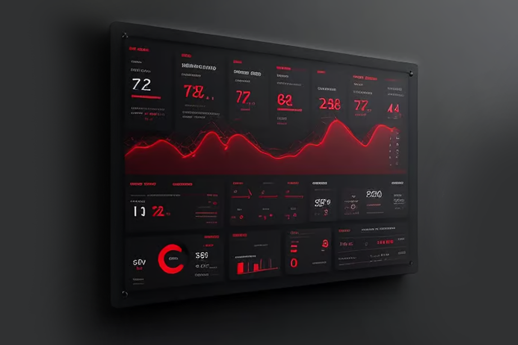
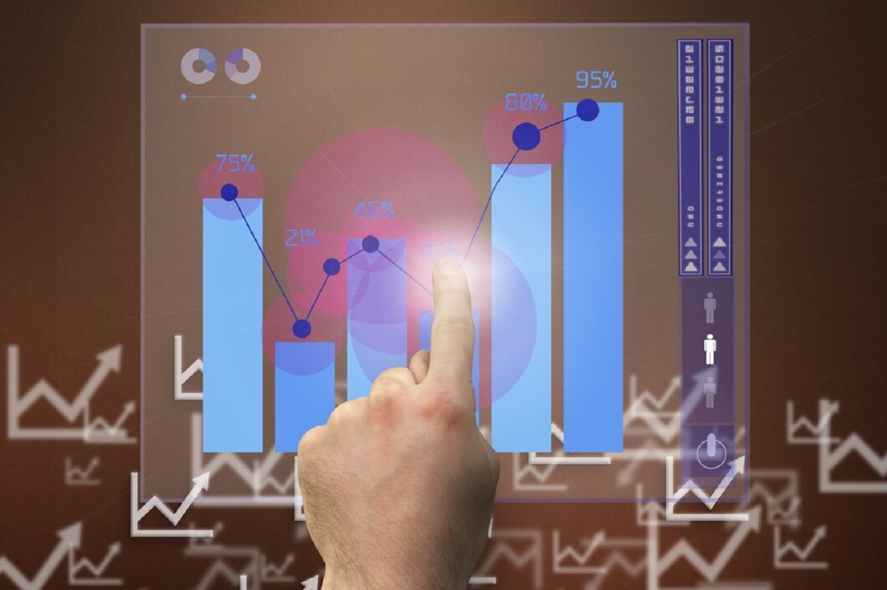
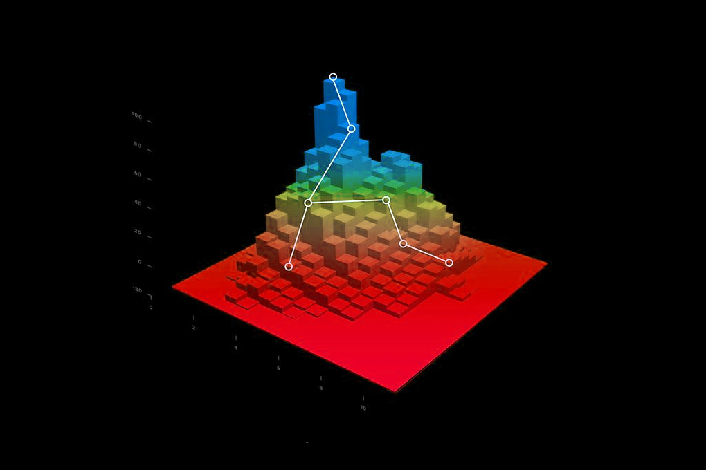
What Are Types of Data Visualizations?
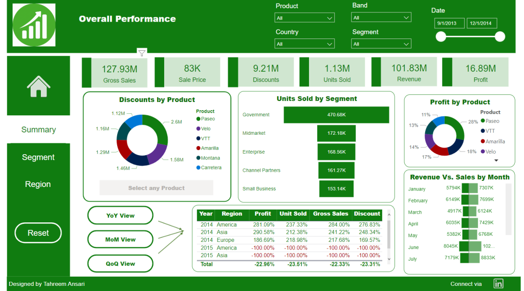
Data visualization tools and techniques present data in dashboards. They are effective means of tracking and visualizing data sets from multiple sources. There are several common data visualization types, including:
- Tables: They are suitable for presenting information in a structured way with rows and columns.
- Pie charts/stacked bar charts: They are suitable for organizing and comparing the proportions of one component to the rest of them.
- Line graphs/area charts: They are suitable for visualizing changes over time.
- Histograms: They are suitable for displaying outliers in a dataset.
- Scatter plots: They are suitable for visualizing the relationship between two variables.
- Heat maps: They are suitable for displaying behavioral data on websites or maps in different locations.
- Treemaps: They are suitable for displaying hierarchical data.
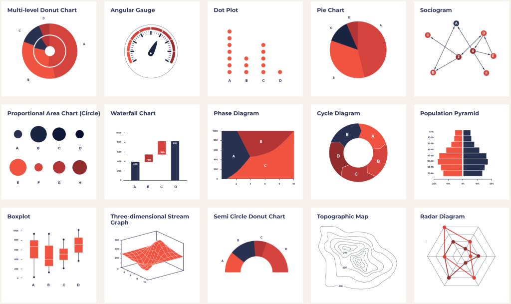
However, data visualization types don’t stop at just simple graphs and pie charts. They are just typical data graphics. More than that, you should explore a wide range of mix and match combinations. Some more examples are Area Chart, Bar Chart, Box-and-whisker Plots, Bubble Cloud, Bullet Graph, Cartogram, Circle View, Dot Distribution Map, Gantt Chart, Highlight Table, Matrix, Network, Polar Area, Radial Tree, Streamgraph, Text Tables, Timeline, Wedge Stack Graph, Word Cloud…
Data Visualization Tools (Free & Paid)
Data visualization tools create visual presentation data imported from multiple data sources. The top 10 data visualization tools (free and paid) are Tableau, QlikView, Microsoft Power BI, Plotly, Sisense, Excel, Zoho Analytics, Infogram, Datawrapper, and Google Charts. These tools are highly recommended thanks to their ease of use, diverse visualization styles, and capability to handle large data sets.
Read the pros, cons, pricing, and analysis of the best tools: Top 10 Best Data Visualization Tools 2023 (Free & Paid)
| With the help of data visualization, company directors will be presented with comprehensive reports, which contribute to better decision making. Synodus provides Data Visualization services, including advisory, implementation, support, migration, BI reporting components and managed services to help companies benefit from a high-performing Data Visualization. | |
Wrapping Up
We hope that reading through this article would give you an overview of data visualization and acknowledge its impacts on corporations’ decision-making process. Whether your company is at the initial stage of nurturing data-driven culture or already reached data maturity; we believe that understanding the basics of data visualization thoroughly is still a big plus.
In case you are still in hunger for more information, here are several data visualization-related articles collected & written by Synodus that we suggest you check them out
More related posts from Big data blog you shouldn’t skip: