Traditional data visualization techniques and their limitations
Understanding the foundations is important to appreciating the fascinating paths that data visualization is taking in its quickly changing landscape. Traditional data visualization techniques, such as Excel and PowerPoint, have long been the stalwarts of data presentation. Let’s delve into their strengths and limitations.
With its familiar spreadsheet format, Excel excels in handling structured data. It provides a robust framework for organizing information, performing basic calculations, and creating static visualizations. Excel’s strength lies in its simplicity and accessibility, making it a go-to tool for many.
On the other hand, PowerPoint is synonymous with dynamic presentations. Thanks to its slide-by-slide approach, it’s a powerful medium for conveying data-driven narratives. PowerPoint’s strength lies in its ability to quickly tell a story, guiding the audience through complex data points.

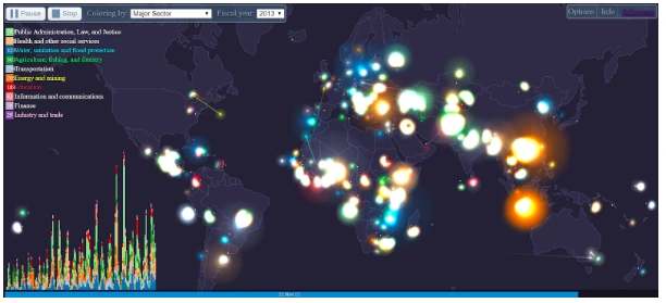
However, both Excel and PowerPoint are constrained by their inherent limitations. They need help when confronted with large volumes of data, making it challenging to represent information comprehensively. Moreover, they need to be more adaptable to dynamic datasets that evolve, often leading to the cumbersome task of manual updates.
Perhaps the most critical limitation of traditional data visualization methods is their inability to offer interactive exploration like a well-seasoned tour guide. They statically present data, preventing users from delving deeper into the insights hidden within the numbers.
These old techniques must be changed in this ever-changing context, where data is rising exponentially and the requirement for real-time insights is crucial. The future of data visualization is about breaking free from these limits, embracing new technology, and exploring new frontiers.
7 Data visualization predictions for 2026 and beyond
AI and machine learning come into play
The development of Artificial Intelligence (AI) and Machine Learning (ML) in the dynamic arena of data visualization is expected to transform how we interpret and interact with data. As we peer into the data visualization crystal ball for 2026 and beyond, it’s abundantly clear that AI-powered data visualizations are the next frontier.
AI is empowering data visualizations to move beyond static representations. By harnessing the immense processing power of AI and ML algorithms, data visualizations are becoming more dynamic and insightful. These smart-systems can analyze massive datasets swiftly, uncovering hidden patterns and trends that might elude human analysts.
Furthermore, AI-driven data visualizations can adapt in real time, ensuring that the insights they convey are always current. This dynamic nature allows organizations to make data-driven decisions faster and more accurately.
Interactive visualization becomes more common
Interactivity is the key component of data visualization in the future. In the pursuit of deeper insights, interactive visualizations are increasingly becoming the rule rather than the exception. The desire to comprehend complicated data can no longer be sated by a straightforward static chart or graph.

Interactive visualizations enable people to go into data themselves, as industry experts have emphasized. They can zoom in, filter, and manipulate visualizations to extract the specific insights they need. This hands-on approach enhances engagement and comprehension, making data more accessible to a broader audience.
Moreover, interactivity fosters collaboration. Teams can explore data, share findings, and collectively make informed decisions. With data becoming increasingly complex, interactive visualization tools are essential for navigating this intricate terrain. Tableau reports that 74% of respondents think data visualization gives a “very high” or “high” increase in business user insights.
These trends underscore the evolution of data visualization, setting the stage for a future where data is not just seen but experienced and understood at a profound level.
Virtual and augmented reality could be a new reality
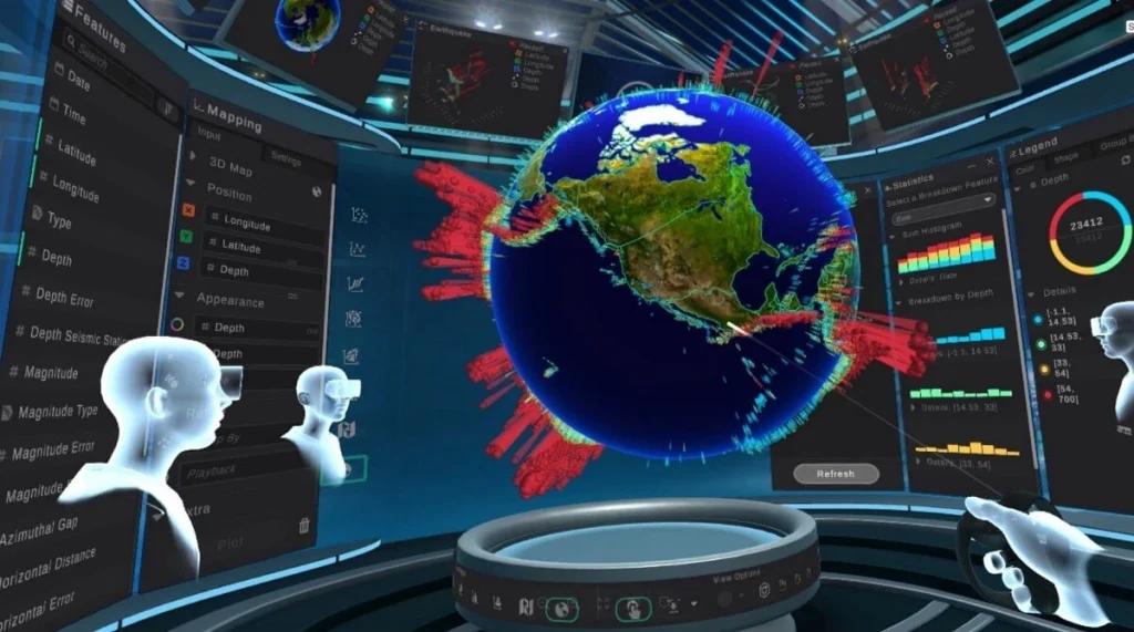
We may find ourselves immersed in a world where Virtual Reality (VR) and Augmented Reality (AR) are important tools for interpreting complex data in the not-too-distant future of data visualization. This enticing notion of combining data with immersive technologies has the potential to open up new dimensions in information display.
Imagine donning a VR headset to step directly into your data landscape. AR overlays pertinent information onto your surroundings, seamlessly blending the digital and physical worlds. These innovations offer a fresh perspective, allowing users to interact with data unimagined.

VR and AR can break down the barriers to data comprehension. Complex datasets can be transformed into immersive, 3D visualizations that users can explore intuitively. This not only enhances comprehension but also makes data more engaging and memorable.
Data storytelling is irreplaceable
While technology advances, one fundamental aspect of data visualization remains timeless – storytelling. In the era of data overload, the ability to craft compelling narratives from data is more crucial than ever.
Compelling data storytelling goes beyond presenting numbers; it involves weaving a narrative that captivates the audience. It’s about contextualizing data, highlighting trends, and providing insights that drive action. Data storytelling humanizes data, making it relatable and actionable.
A well-crafted data story is a strong weapon in the fast-paced world of data, where attention spans are short. It not only informs but also motivates people to take action. Mastering the art of data storytelling will be a cornerstone of success in the growing world of data visualization, whether you’re a data analyst, marketer, or executive.
Real-time data visualization
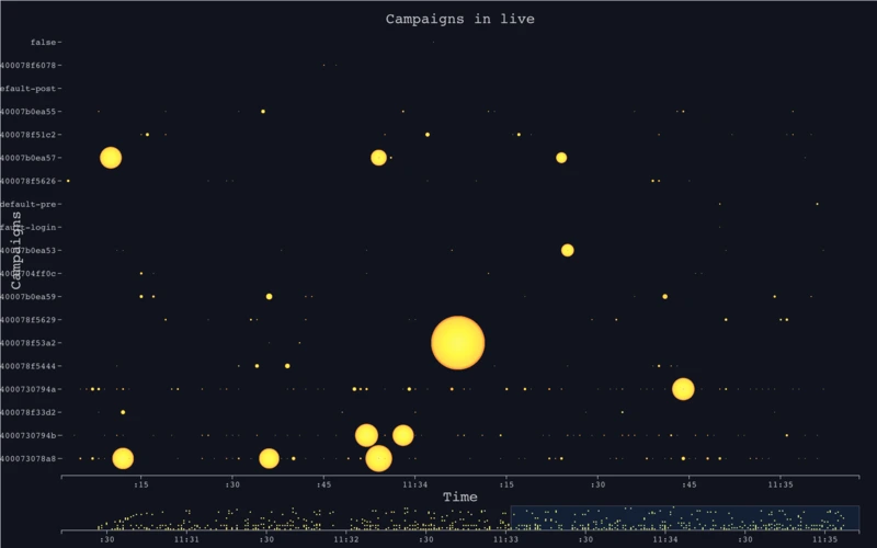
The data-driven landscape is shifting towards real-time insights, and data visualization is at the forefront of this transformation. In 2026 and beyond, real-time data visualization is poised to become a game-changer.

(Cre: Juntao Qiu)
Traditional static reports are being replaced by dynamic dashboards that provide up-to-the-minute information. Businesses can now monitor key metrics, track customer behavior, and respond to real-time market changes. This agility is invaluable in today’s fast-paced business environment.
Real-time data visualization also enhances decision-making. With data updated in real-time, organizations can make informed choices promptly. Whether adjusting marketing strategies or managing supply chains, real-time insights are a competitive advantage.
Personalization is a key to success
One-size-fits-all data visualizations are becoming a relic of the past. In the future, personalization will be the key to delivering meaningful insights to individuals and teams.
Advanced data visualization tools allow users to tailor their dashboards to their needs. Whether you’re a marketing manager, financial analyst, or HR director, you can create custom visualizations highlighting the metrics and KPIs most relevant to your role.
Personalization also extends to the user experience. AI algorithms can learn user preferences and recommend relevant visualizations and insights. This level of personalization ensures that every user can access the data they need in a format that suits them, ultimately boosting productivity and data-driven decision-making.
As we look ahead, real-time data visualization and personalization are paving the way for a more agile and user-centric approach to data analysis. These trends underscore the dynamic nature of data visualization and its vital role in shaping the future of decision-making.
Data would be more mobile-friendly
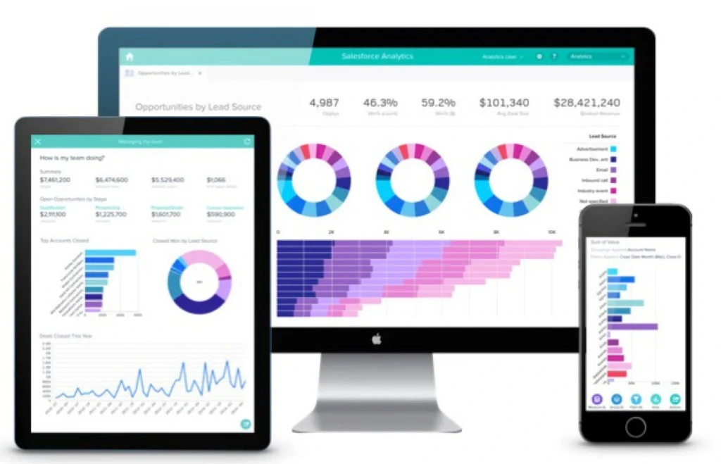
Mobility takes central role in the future data visualization scene. With the growth of smartphones and tablets, data accessibility on mobile devices has become a requirement rather than a luxury.
Mobile-friendly data visualizations are designed to fit seamlessly on smaller screens while maintaining clarity and functionality. This trend ensures that decision-makers can access critical insights on the go, whether in a boardroom meeting or traveling for business.

The growing trend of remote work emphasizes the significance of mobile-friendly data even more. Accessing information and insights from mobile devices is essential for maintaining productivity and making informed decisions as professionals operate from a variety of locations more frequently.
As we navigate the data-rich landscape of tomorrow, the adaptability of data visualization to mobile platforms will be paramount. This shift towards mobile-friendliness empowers decision-makers with the flexibility to access and act on data whenever and wherever they need it.
Get prepared for the data visualization future with Synodus
Staying ahead of the curve in this fast-paced world of data visualization necessitates more than just understanding trends; it necessitates teamwork. With new, ever-changing technologies shaping the data landscape, organizations need to work together to harness the full potential of these innovations.
As the data visualization landscape evolves, Synodus stands ready to be your strategic data partner in embracing these changes. Our commitment to keeping you at the forefront of data innovation ensures that you’re not just prepared for the future – you’re leading the way.
In this constantly shifting environment, collaboration is the key to success, and we is here to empower you on this thrilling journey. Are you ready for a chat?
More related posts from Big data blog you shouldn’t skip:
- Data Visualization Best Practices For Clear, Impactful Visuals
- Top 20+ Data Visualization Books Recommended For Beginners And PROs
How useful was this post?
Click on a star to rate it!
Average rating / 5. Vote count:
No votes so far! Be the first to rate this post.


