What is considered a good data visualization?
Specific qualities characterize what is good in this field when producing successful data visualizations, particularly in dashboards. These elements should be present in a well-designed data dashboard to ensure it effectively accomplishes its goal. Let’s delve more into these fundamental ideas:
Clarity, Intuitiveness, and Customizability
Great dashboards are clear, intuitive, and customizable. They should present information in a way that is immediately understandable to users. Imagine a dashboard as a road map; it needs to guide users seamlessly, allowing them to grasp essential insights quickly. Here’s how this principle is achieved:
- Clarity: A good dashboard simplifies complex data, making it easy for stakeholders to understand, analyze, and present key insights. It displays information cleanly and straightforwardly, minimizing cognitive load.
- Intuitiveness: Information should be presented intuitively, with the most critical data components accessible at a glance. Users should be able to navigate and decipher the dashboard easily.
- Customizability: Every user has unique needs. Effective dashboards allow users to customize the displayed data and visual components according to their requirements. This personalization enhances usability and ensures the dashboard remains relevant to user personas.

One-click accessibility
Great dashboards provide everything one click away. The aim is to make all essential information immediately accessible to users, reducing the effort required to find what they need:
- Prioritized Data: Data should be prioritized based on its importance. Critical information should be prominently displayed on one screen, ensuring users don’t have to dig deep for critical insights.
- Visual Hierarchy: Dashboards should follow a clear visual hierarchy emphasizing essential elements. Users should be able to discern trends and data changes over time quickly.
- Customization with Filters: Filters should be integrated into the design, allowing users to customize how data is displayed. This can include options like labels, categories, and Key Performance Indicators (KPIs), improving usability and filtering content effectively.
Reduced complexity for enhanced clarity
Providing clear and concise information is paramount. Dashboards should present only the most relevant data, eliminating clutter and reducing complexity:
- Selective Data Display: Designers should carefully select the most relevant subset of data to display. Only necessary metrics should be included to ensure information overload.
- Cognitive Load Reduction: Dashboards should aim to minimize users’ cognitive load. A clean, straightforward interface facilitates quick comprehension, saving users time and frustration.
- Progressive Drill-Down: An effective dashboard should employ a progressive drill-down system. It starts with a general overview and allows users to delve into more detail gradually. This approach aids in data prioritization and ensures clarity.
A good data visualization, especially in the form of a dashboard, should prioritize clarity, intuitiveness, and customizability while reducing complexity.
Top 11 best practices for data visualization
Data visualization is an art form that needs both creativity and respect for fundamental principles. In this section, we’ll look through the top 11 data visualization best practices, drawing on credible sources and bringing new perspectives.
Clarify the purpose
Every journey into data visualization begins with precisely grasping your purpose or “why.” It is the guiding light that shapes your story. We divide the reasons for data visualization into three categories:
- Ad hoc: When you need immediate insights or personal clarity, generating visualizations that allow you to explore data quickly is critical. The audience, in this case, is frequently oneself or competent colleagues.
- Strategic Planning: In this context, visualizations help to inform decision-making for large initiatives. The broad audience consists of executives seeking approval and personnel overseeing project execution.
- Decision Support: For ongoing decision-making, tailored data visualizations are essential. These cater to business leaders and employees making data-driven choices.
Defining your “why” isn’t a mere formality; it’s the cornerstone of impactful data visualization, ensuring your message resonates and prompts action.
Maintain simplicity
Once you’ve defined your “why,” simplicity becomes paramount. You aim to communicate your story in the simplest way possible, avoiding unnecessary complexity. Here’s how to achieve clarity effectively:
- Avoid Overly Fancy Visuals: While using visually engaging charts and graphs is tempting, consider simplicity. For instance, when comparing two revenue and operations cost values, two single-value charts can provide clarity immediately instead of using complex visuals.
- Limit Categories: Limit the categories to five to seven in your charts and graphs. This reduces clutter and ensures that the information is digestible at a glance.
Simplicity means something other than sacrificing detail. For instance, you can maintain points while keeping the presentation clear when breaking down operations costs over time. The key is to balance providing essential information and overwhelming your audience with complexity. Always remember your ” why, ” ensuring your visualizations effectively serve their purpose.
Embrace clusters, avoid clutter
Simplifying complex data can be challenging. You can only simplify so much before the essence of your data story starts to shift. In such situations, psychology’s Gestalt principles come to the rescue. We won’t dive into complex psychology theories, but we’ll explore two key concepts from Gestalt that can significantly enhance your data visualizations: similarity and proximity.
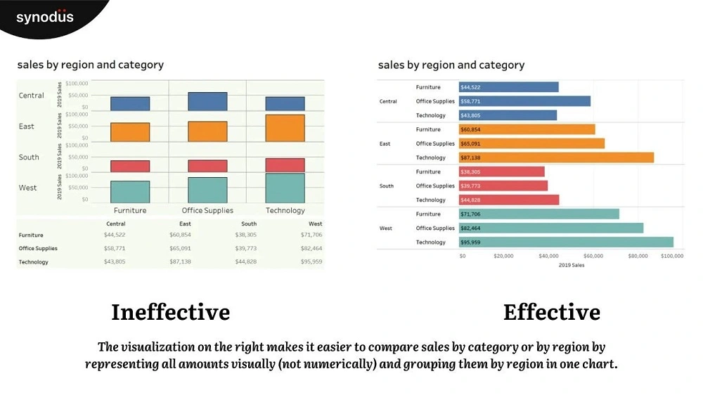
Objects that appear similar are more likely to be mentally grouped. Color coding is a valuable approach to establishing similarities. Assigning a distinct hue to each sales agent, for example, allows visitors to recognize their efforts readily. Using these colors consistently throughout your visualizations makes it easy to identify patterns, favorable trends, and places that require work.
Physical proximity causes objects to automatically be viewed as belonging to the same group. Consider data columns: despite their varied colors, they may be arranged to form distinct groups. Think of this as a means to break up complicated information into digestible chunks that are simpler to understand.
Consider bar charts as a reliable option
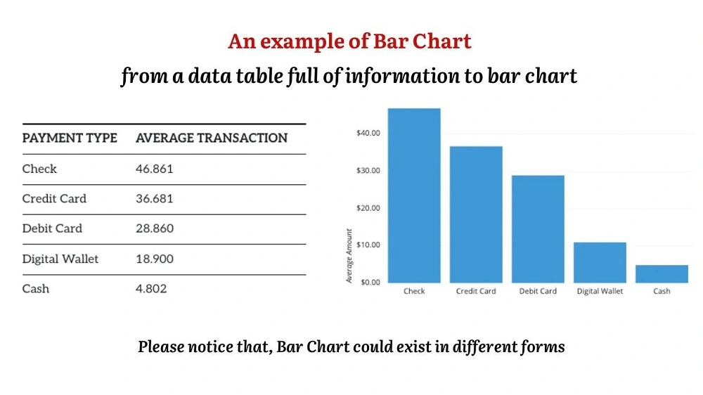
When choosing the right chart type, bar charts often shine as the go-to choice. They consistently rank high in terms of effectiveness. The reason behind their effectiveness lies in how the human eye processes them.

The human eye naturally compares the endpoints of each bar. When you glance at a bar chart, your eyes intuitively focus on these endpoints, making comparisons easy. For categorical data, horizontal bar charts are often a preferred choice. However, there’s an important consideration to keep in mind: the assumption that bars start at zero. Always start the y-axis at zero or explicitly indicate otherwise to maintain accuracy.
A direct comparison of a bar chart and a pie chart exemplifies this: Because the human eye compares the arcs or segments in pie and donut charts, they can sometimes mislead readers. The human eye perceives the shape of each element, which could be a more precise way to understand data.
While bar charts are dependable for maintaining data accuracy and clarity, there are still specific scenarios where pie charts and donut charts can be suitable, depending on the story you wish to convey. Making your data visualizations informative, simple to understand, and visually appealing will ensure that your message is effectively communicated.
Emphasize the power of storytelling
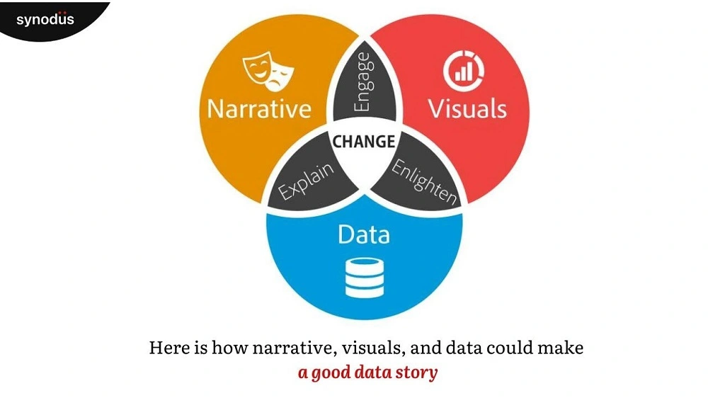
Data visualization is more than just presenting numbers; it’s the art of storytelling with data. To craft a compelling narrative, your visualization must convey valuable data and resonate with your audience. Nancy Duarte, in her book “Resonate” on Business Storytelling, emphasizes that “Facts alone fall short.”
To truly resonate, prioritize your audience’s needs over your objectives. This is where pie charts and donut charts, often considered “dessert charts,” find their niche. While they may not be ideal for displaying quantitative data, they excel at conveying the concepts of a whole and its parts.
Pie charts, when adequately labeled, help visualize the composition of a whole, allowing you to grasp the relative proportions of various components quickly. Similarly, donut charts illustrate how individual segments contribute to the overall picture when combined with influential legends.

Remember that your visualization should cater to your audience’s needs, even if it goes against conventional wisdom. Focusing on what matters most to your viewers allows you to create data stories that empower and engage.
Apply text carefully and intentionally
The role of text in data visualization is crucial, but it requires careful consideration. While an overload of text can be distracting and disrupt the visual flow, there are instances where text is essential for clarity. Here are some guidelines to enhance your visualizations:
- Prioritize Placement: Position the most critical information at the top or in the upper left corner of your visualization. This area naturally attracts the viewer, ensuring key points are first noticed.
- Limit Views: Restrict the number of views in your visualization to three or four. Excessive complexity can obscure the big picture, making it harder for your audience to grasp the central message.
- Group Filters: If you have multiple filters, consider grouping them and adding a subtle border. This visually indicates that these filters share standard features, enhancing clarity.
- Embrace Interactivity: Interactive components can turn a perplexing graphic into a fascinating analysis tool. Take your audience through the story and ensure they understand how to engage with the data. Subtle directions can stimulate experimentation.
You may enhance your visualizations from decent to extraordinary by selecting text and following these rules.
Leverage color cues for enhancement
Color is a powerful tool in data visualization, capable of conveying meaning without the need for words. However, using color effectively requires finesse and restraint. Here’s how to harness the potential of color cues:
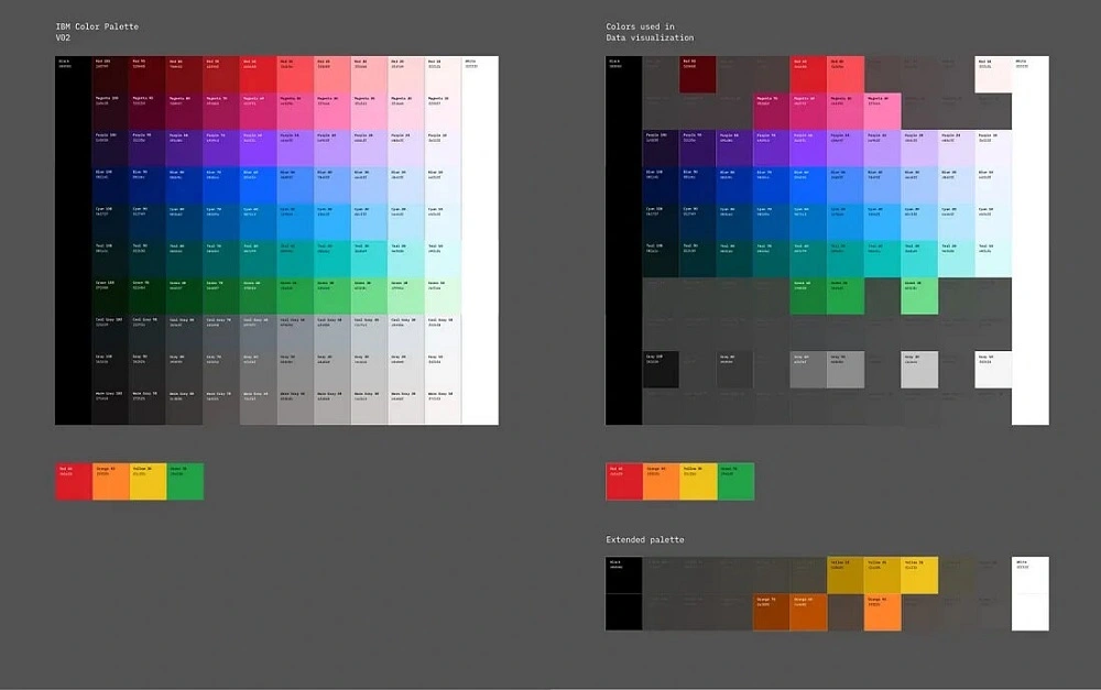
- Simplicity Matters: Color may have a big impression, but keeping things simple is better. To emphasize and highlight important information, use color. While too many shades of one color will muddy the data, using too many colors can produce visual disorder.
- Color associations: Consider employing perceptive hues that correspond to viewers’ expectations. Use red for heat and blue for cold, for instance, when displaying temperature data. The processing of information is sped up by familiarity with color associations.
- Consistency and Contrast: Maintain uniformity in the use of color across all values or elements. Data contrasts should be highlighted using separate colors. High-contrast colors make it easier for viewers to spot important insights quickly.
- Clarify Color Meanings: Ensure your audience understands the meaning behind the colors. Provide clear legends or labels that explain the significance of each color used in your visualization.
- Accessibility: Be mindful of color-blind individuals when selecting colors. Choose color combinations that are distinguishable for all viewers.

Avoid choosing dark, low-contrast colors that make it difficult to read. When highlighting essential findings, choose high-contrast colors like navy blue and light blue to distinguish between data points clearly. You can make sure that your visualizations effectively convey your message, improve comprehension, and engage your audience by following these data visualization best practices.
Strategically use sizes to visualize values
Size can be a potent ally in the art of data visualization. Beyond mere aesthetics, size is crucial in emphasizing vital information and providing context. For instance, consider a visualization depicting endangered animal shapes. Here, the size of each animal shape mirrors its actual size compared to others, offering viewers an intuitive grasp of relative proportions. Moreover, size can serve as a dynamic indicator of scaled values. Scaling shapes based on data values allows you to create nuanced visualizations that convey intricate patterns and relationships. This technique finds particular utility in maps, where multiple data points converge. Combining size with color as an additional marker enables viewers to navigate complex visualizations more efficiently, enhancing their understanding.
Examine business insights
Undoubtedly, the diligent examination of business insights is an indispensable practice in today’s intensely competitive landscape. It resembles unearthing hidden treasures within the vast realm of data. This practice, integral to data visualization, involves dissecting information to reveal crucial correlations within a business context.
These insights serve as guiding beacons for informed decision-making, steering actions in alignment with organizational objectives. Additionally, they offer a lens through which organizations can gain deep understanding of customer preferences, ensuring the delivery of high-quality products and services that resonate with their target audience. Significantly, insights facilitate proactive problem-solving, identifying and mitigating potential issues before they escalate into significant challenges, thereby conserving valuable time and resources.
Avoid distracting elements
Exceptional data visualizations are characterized by their simplicity. Even the most insightful graphics can be rendered ineffective by clutter and numerous distractions. The intended message is lost when there is an overabundance of color, hectic background patterns, or congested layouts. Your objective should be to produce visualizations that effortlessly lead your viewers to insightful conclusions in a world with abundant data. This entails removing anything extraneous, including extraneous labels, distracting graphics, and irrelevant data points. Put legibility first by making sure titles and labels are understandable. Maintaining a clear and focused design makes it possible for your audience to extract the vital points without being distracted.
Maintain consistency in everything
Consistency serves as the silent conductor orchestrating the symphony of data visualization. The thread weaves together typography, color palettes, and graphic elements to create a harmonious and user-friendly experience. A well-structured dashboard design relies on consistent elements that are not only visually appealing but also informative. When designing dashboards, less can indeed be more. Limit the variety and size of fonts to maintain recognizability and ensure that headings consistently adhere to the same size. Consistency in color application fosters clarity and prevents viewer confusion, providing a seamless narrative flow. By employing color to highlight specific dimensions or metrics consistently across all dashboards, you facilitate the viewer’s comprehension of critical information.
Furthermore, an orderly hierarchy and organization of visual elements are essential for clarity. With a structured presentation, you avoid overwhelming viewers, making it easier for them to navigate your data. As seen in the example, a well-organized layout ensures that the most critical information is easily accessible, fostering engagement and comprehension. This adherence to consistency throughout the visualization not only enhances aesthetics but also elevates the communication of valuable insights.
Where to get started with data visualization?
By now, you’ve already skimmed through the essential best practices for data visualization, equipping yourself with the knowledge to create impactful and insightful visuals. But where do you begin your data visualization journey?
Numerous resources are available for those new to the field or seeking guidance on crafting compelling data narratives. Online courses, books, and tutorials can provide valuable insights into data visualization techniques. Tools like Tableau, Power BI, and Excel offer robust platforms to bring your visualizations to life.
However, if you’re looking for a more personalized and practical approach to harnessing the power of data visualization, consider Synodus’s services.
Synodus services: Unlocking the potential of data visualization
At Synodus, we understand that data is more than just numbers; it’s the key to informed decision-making, innovation, and growth. Our expertise in data visualization allows us to transform your data into actionable insights that drive your business forward.
Our services include:
- Custom Data Visualization Solutions: We tailor data visualization solutions to your unique needs, ensuring that your data tells a compelling story that resonates with your audience.
- Data Analysis and Interpretation: We go beyond creating visuals and provide in-depth analysis and interpretation of your data, unlocking hidden insights that can revolutionize your strategies.
- Consultation and Training: Whether you’re new to data visualization or looking to enhance your team’s skills, our experts offer consultation and training services to empower you with the knowledge and tools needed to excel in this field.
Wrapping up
In the data-driven era, the ability to communicate complex information clearly and persuasively is a valuable asset. Data visualization is the bridge that connects raw data to meaningful insights, enabling organizations to make informed decisions, captivate audiences, and drive success.
As you embark on your data visualization journey, remember the best practices shared in this article: clarity, simplicity, storytelling, thoughtful text usage, strategic color application, meaningful examination of insights, avoidance of distractions, and consistency in design.
Ready to visualize your data’s potential? Contact us today to explore how our services can unlock the true value of your data. Let’s embark on a data-driven journey, shaping a future of insights and innovation.
More related posts from Big data blog you shouldn’t skip:
- Top 20+ Data Visualization Books Recommended For Beginners and PROs
- The Future Of Data Visualization: 7 Predictions For 2025 And More
- 7 Retail Analytics Challenges And How To Overcome Them
How useful was this post?
Click on a star to rate it!
Average rating / 5. Vote count:
No votes so far! Be the first to rate this post.


