How to choose the best data visualization book?
Whether you’re a beginner looking to learn the basics or an experienced professional seeking advanced techniques, opting for a suitable data visualization book can significantly enhance your skills and knowledge. Hence, before making any purchases, please carefully consider your skill level, reading target, different expertise levels of each book, etc.
Here are some factors you should consider to select a book that provides the proper knowledge and skills to excel in the data visualization field.
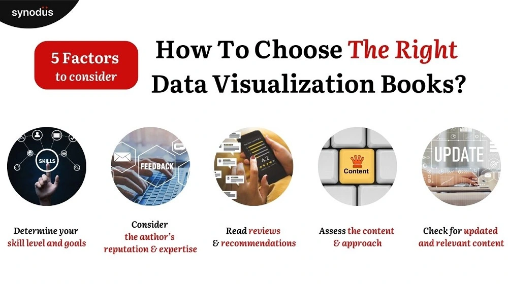
Determine your skill level and goals
Before diving into the vast selection of data visualization books available, assessing your current skill level and defining your goals is essential.
Let’s ask yourself the following questions:
- Are you a beginner, intermediate, or advanced learner?
- Are you looking for a general introduction to data visualization or a more specialized focus?
- What specific skills or techniques do you want to learn or improve?
By understanding your skill level and goals, you can narrow your options and choose a book that aligns with your needs.
Consider the author’s expertise and reputation
The author’s expertise can undoubtedly impact the quality and credibility of a data visualization book, so don’t hesitate to look for authors with a strong background in data visualization, data analysis, or related fields.
Are they well-respected and recognized for their contributions? Do they actively engage with the community through conferences, workshops, or online platforms? And then, you could research their credentials, experience, and any previous works they have published. It will be better if the skillsets or knowledge you want to learn align with what they are good at.
Read reviews and recommendations
One of the best ways to gauge the quality and usefulness of a data visualization book is through reviews and recommendations from the community. You could always look for reviews on availably reputable platforms such as Amazon, Goodreads, or other specialized data visualization websites, like our blogs. Don’t forget to pay attention to both positive and negative feedback so you could get a balanced perspective without bias.
The other souce is the recommendation from professionals, or colleagues in your network. They could provide insights based on their own reading experience, and suggest books that might be helpful to you too.
Assess the content and approach
Each data visualization book has its own approach and content structure. Some books focus on theory and concepts, while others emphasize practical techniques and case studies. Therefore, you had better reflect on your preferred learning style and choose a book that most aligns with it.
Our tip is to always look at the table of contents first and pick the chapters you feel most interesting before buying the book. This action will give you an overview of the book’s main idea, content depth, and clarity of explanation.
For those new to data visualization, finding books that balance theory and practical applications for a comprehensive learning experience is helpful.
Check for updated and relevant content
Data visualization is a dynamic field, with new tools, techniques, and best practices emerging regularly. It’s essential to choose a book that offers updated and relevant content. You could also check the publication date to ensure the book is relatively recent. This does not mean older books are not valuable, but they may lack coverage of newer advancements in data visualization.
Additionally, consider whether the book covers the specific tools and technologies you are interested in. For example, if you want to learn data visualization using Python and libraries like Matplotlib or Seaborn, ensure the book includes relevant examples and instructions for these tools.
We hope that these tips above could hekp you choose the most suitable data visualizaion book, which supports your educational objectives, and ehances your ability to visualizat data successfully.
Top 20+ Data visualization books for beginners and professionals
Let’s explore the following list of 25 excellent books about data visualization better to grasp their importance, applications, and libraries. Although these listed books are merely for reference, we believe everyone can learn some parts from them.
1. Storytelling with data
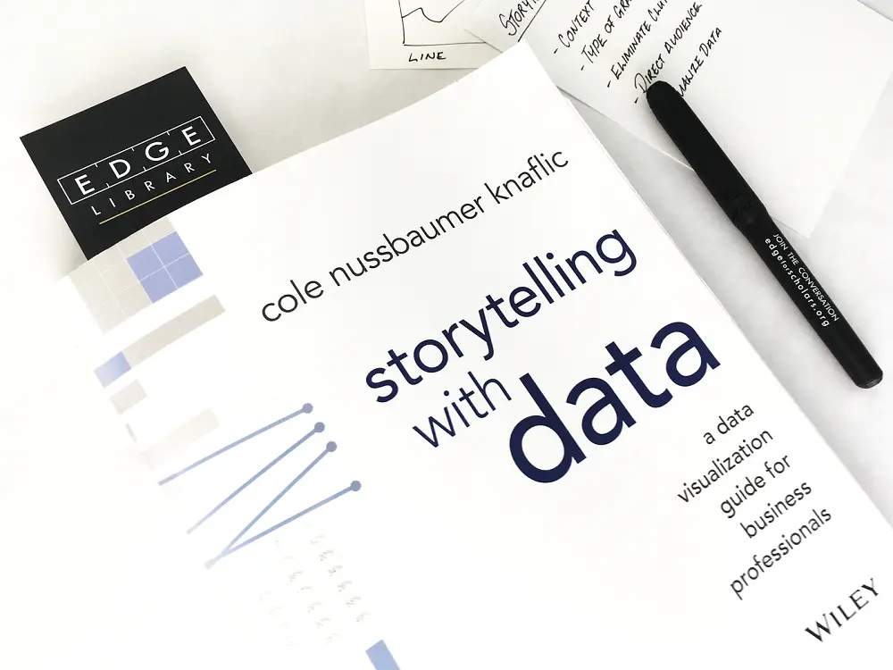
Author: Cole Nussbaumer Knaflic
Where to buy: its website or Amazon
Best for: individuals working in business and related fields (from beginners to experienced practitioners)
Overview:
Particularly with data visualization, telling a story is not a natural talent. Storytelling With Data shows you how to use your data in a creative and valuable way rather than the usual methods. Some main points that you might learn from the book are:
- The significance of data visualization for business professionals and the concept of storytelling as a powerful tool to convey insights.
- The foundational principles of data visualization including understanding the audience, decluttering visuals, selecting appropriate chart types, and effectively using color and typography.
- Guidance on selecting the right visual representations for different data types and messages, various chart types, such as bar charts, line graphs, scatter plots, and more.
- The structural and stylistic aspects of data visualization: techniques for organizing data, creating clear hierarchies, adding annotations, and designing compelling titles and labels.
- The process of creating cohesive and compelling data stories.
- Numerous real-world case studies (both good and bad examples) demonstrate the application of the principles discussed throughout the book.
- Practical tips and exercises to help readers apply the concepts and techniques presented.
Best parts of the book:
The finest aspect of the book lies in its practical and actionable approach. It provides clear and concise explanations of fundamental data visualization principles, accompanied by numerous real-world examples and case studies. Readers gain insights into the author’s thought process behind compelling data storytelling and learn how to apply these concepts to their work.
One of the book’s key strengths is its emphasis on simplicity and clarity in data visualization. It guides readers on decluttering visuals, selecting appropriate chart types, using color effectively, and organizing data to enhance understanding. The book also highlights the importance of context and narrative in data storytelling, enabling readers to craft compelling messages that resonate with their audience.
The book also provides practical exercises and tips, encouraging readers to apply the concepts and techniques discussed actively. This hands-on approach allows readers to practice and refine their data visualization and storytelling skills in a structured manner.
2. Avoiding data pitfalls
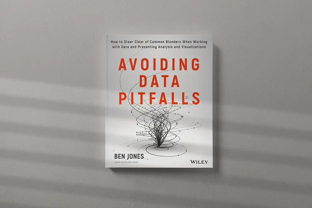
Author: Ben Jones
Where to buy: Amazon
Best for: data analysts, data scientists, business analysts, researchers, and anyone involved in data-driven decision-making processes (from beginners to experienced practitioners)
Overview:
The book focuses on helping readers navigate common mistakes and pitfalls encountered when working with data analysis and presenting findings through visualizations. The book aims to equip individuals with the knowledge and strategies to identify and avoid these pitfalls, ultimately leading to more accurate and impactful data-driven decision-making.
Since the majority of organizations anticipate employees with little to no formal training to evaluate and present data efficiently, Avoiding Data Pitfalls provides a thorough explanation to:
- Examine the “data-reality gap” that widens as a result of our reliance on data.
- Discover how the appropriate tools can organize the data visualization process.
- Learn from and steer clear of typical errors in data analysis, particularly data visualization.
- Create and provide data visualizations that are convincing, accurate, and clear.
Best part of the book:
The best parts of the book lie in its practical approach and real-world examples. Ben Jones draws from his experience in the field to provide concrete examples of pitfalls and mistakes, along with strategies to overcome them. The book offers actionable advice and best practices, presenting readers with a toolkit to enhance the accuracy, clarity, and impact of their data analyses and visualizations.
The book includes data collection, data cleaning and preprocessing, analysis techniques, statistical fallacies, visualization design, and the communication of data insights. We can take it as a valuable resource for individuals seeking to enhance their data literacy and make better-informed decisions based on data analysis and visualizations.
3. Fundamentals of data visualization
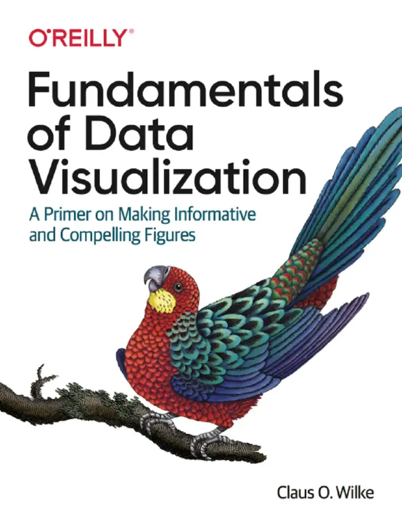
Author: Claus O.Wilke
Where to buy: Amazon
Best for: data scientists, analysts, researchers, designers, and students studying data-related fields (from beginners to experienced practitioners)
Overview:
The book covers a broad range of topics related to data visualization. It starts by introducing the basic principles of visual perception and cognition, explaining how humans interpret visual information. It then delves into various aspects of data visualization, including data types, visualization design principles, color theory, graphical elements, and interaction techniques.
It also includes advice on how to convert large statistics into understandable and persuasive figures as well as a wealth of examples of often occurring visualization issues.
Here are the most important components of good data visualization, according to author Claus O. Wilke:
- The fundamental ideas behind using color to emphasize, differentiate, or symbolize a value
- The significance of redundant coding to make sure you give important information in several different ways
- The visual manual for applying standard data visualization techniques
- several instances of both good and terrible numbers
- How to properly use statistics in a report or paper to make a captivating tale
Best part of the book:
One of the notable strengths of this data visualization book is how it emphasizes this field’s underlying principles and concepts. It provides readers with a solid theoretical foundation, enabling them to make informed design choices and understand the rationale behind effective visualizations. The author explains complex concepts in a clear and accessible manner, making it easier for readers to grasp and apply them in practice.
Additionally, the book incorporates numerous visual examples and case studies to illustrate different visualization techniques and design considerations. These examples help readers develop an understanding of how to apply the principles discussed and inspire them to create engaging and informative visualizations.
Fundamentals of Data Visualization also explores the challenges and considerations involved in designing interactive visualizations and effectively communicating data narratives. It addresses topics such as storytelling, narrative structures, and the ethical implications of data visualization.
Overall, the book is highly regarded for its comprehensive coverage of the fundamental principles of data visualization, its accessible writing style, and its emphasis on both theoretical concepts and practical applications.
4. Good charts: The HBR guide to making smarter, more persuasive data visualization
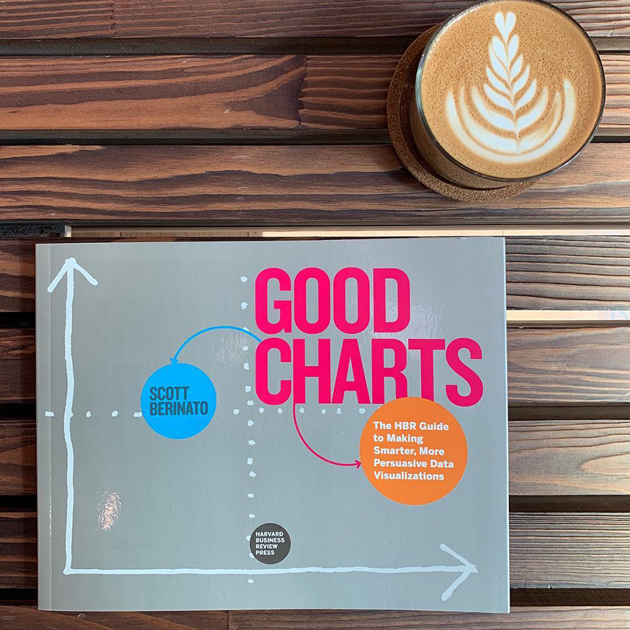
Author: Scott Bernatto
Where to buy: Amazon
Best for: data analysts, business professionals, researchers, designers, and anyone involved in presenting data-driven information (from beginners to experienced practitioners)
Overview:
Scott Berinato offers a crucial tutorial on data visualization in Good Charts, explaining how individuals may utilize this new language to captivate and persuade their audience. This book draws on both known and cutting-edge research in visual perception and neurobiology, so it is more than just a static collection of guidelines for creating visualizations.
The four sections of the book are:
- Understand: This section explores the cognitive aspects of data visualization, emphasizing the importance of understanding the audience, clarifying the message, and considering the context in which the charts will be viewed.
- Create: Here, the author delves into the visual aspects of chart design, discussing principles such as color, typography, and layout. The section also covers different chart types and how to choose the most appropriate visualization for specific data and objectives.
- Refine: This section focuses on the practical aspects of chart creation. It provides step-by-step guidance on how to design and build effective charts, including data preparation, chart tools, and techniques for enhancing clarity and impact.
- Present and Practice: The final section addresses the art of presenting data visualizations. It covers storytelling techniques, effective delivery strategies, and tips for engaging and persuading the audience through data-driven narratives.
Best part of the book:
The book provides readers with a critically thinking framework about data and transforming it into meaningful visual representations. It also offers numerous examples and case studies from real-world scenarios, which help illustrate the principles and concepts discussed.
Moreover, the book includes practical exercises and checklists that enable readers to apply the concepts and techniques in a hands-on manner. These exercises help reinforce learning and allow readers to practice creating good charts.
Good Charts shows you how to transform plain, uninteresting charts into clever, appealing visualizations that clearly communicate concepts to your audience.
5. Effective data storytelling: How to drive change with data, narratives, and visual
Author: Brent Dykes
Where to buy: Amazon
Best for: data scientists and analytics professionals
Overview:
Since data storytelling often provides a framework for presenting data insights to both technical and non-technical audiences, Brent Dykes deconstructs the benefits of data storytelling and the essential elements of a successful data narrative in this book.
Instead than concentrating just on how to represent data, according to Dykes, we can also use narrative and storytelling to make decisions based on insights. Dykes created a framework for data storytelling in his book, a method that incorporates the three main components of data, narrative, and images.
Best part of the book:
The outstanding note of this book about data visualization is the creativity. In order to consider the power of storytelling and the psychology of making tales with data, it looks beyond the conventional focus on data visualization. It will teach you the crucial abilities needed to communicate your findings through impactful and enduring data tales. It is essential for everyone who frequently communicates with data because of these factors.
6. Information dashboard design: Displaying data for at-a-glance monitoring
Author: Stephen Few
Where to buy: Amazon
Best for: data analysts, business analysts, dashboard designers, managers, and decision-makers who need to effectively communicate data insights to their audience
Overview:
It provides insights and guidelines for designing effective dashboards to display data in a visually compelling and informative way.
The book focuses on creating dashboards that allow users to quickly grasp key information and monitor data at a glance, at the same time covers various aspects of dashboard design, including the principles of visual perception, data organization, and effective use of charts and graphs.
The importance of simplicity, clarity, and meaningful visual representations to avoid overwhelming users with unnecessary information is significantly emphasized in the book.
Best part of the book:
The author provides a comprehensive set of principles and guidelines for designing intuitive and effective dashboards. These principles focus on clarity, relevance, and ease of interpretation.
The book explores different data visualization techniques, such as charts, graphs, tables, and gauges, and offers insights into selecting the most appropriate visual representations for specific types of data.
Stephen Few also highlights common mistakes and pitfalls in dashboard design, such as cluttered layouts, excessive use of colors, and misleading visual representations. He provides practical advice on how to avoid these mistakes and create visually appealing and informative dashboards.
By learning from practical guidance, best practices, and real-world examples, readers surely can create effective and impactful dashboards that facilitate data-driven decision-making.
7. The big book of data dashboards: Visualize your data using real-world data scenarios
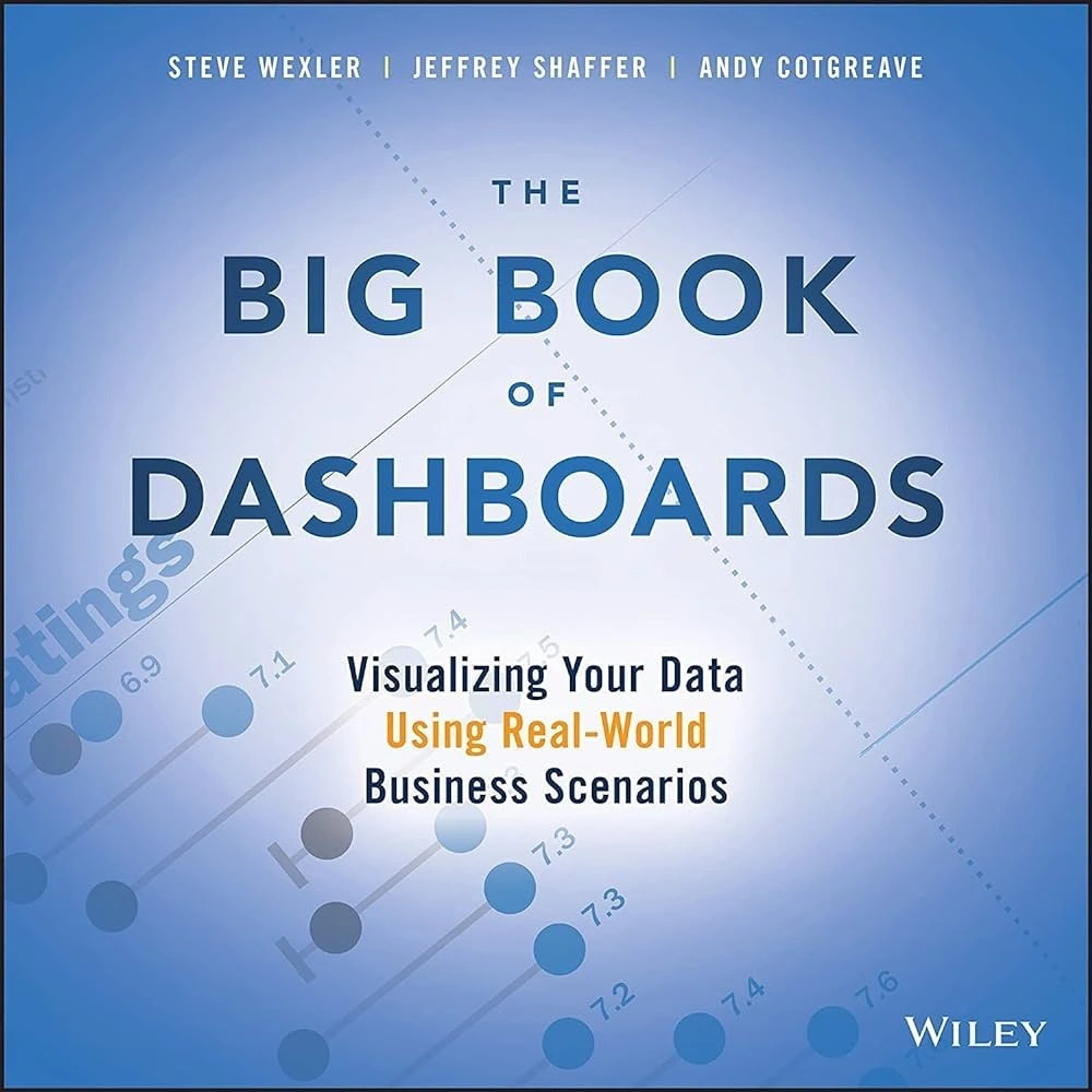
Author: Steve Wexler, Jeffrey Shaffer, and Andy Cotgreave
Where to buy: its website or Amazon
Best for: business intelligence, data analysts, dashboard designers, managers, and decision-makers (from beginners to experienced practitioners)
Overview:
The book serves as a comprehensive guide to creating impactful and insightful dashboards by presenting real-world business scenarios, understanding the audience, and improving data visualizations inside a dashboard.
You will get step-by-step instructions, practical tips, and the best ways to design effective dashboards tailored to specific scenarios. Readers are guided through the entire process, from data preparation and visualization selection to storytelling and user interactivity.
Best part of the book:
Richly illustrated with visual examples and case studies, the book showcases a wide range of dashboards from various industries. These examples demonstrate how to effectively display and analyze data, providing inspiration and practical guidance for readers.
Interestingly, the authors emphasize the importance of user experience and interactivity in dashboards. They offer insights into designing user-friendly interfaces, enabling data exploration, and facilitating data-driven decision-making.
Moreover, with contributions from three experienced authors, the book offers a collaborative perspective, drawing from the expertise of each author. This provides readers with a well-rounded view and diverse insights into dashboard design.
8. The functional art
Author: Alberto Cairo
Where to buy: Amazon
Best for: professionals and enthusiasts interested in data visualization, journalism, design, and communication (from beginners to experienced practitioners)
Overview:
Data journalist, Alberto Cairo, has discussed how to make data visualization art useful in the book Functional Art. By explorng the intersection of information graphics, data visualization, and storytelling, with a focus on creating effective visual representations of data, the book is a valuable resource for anyone interested in improving their data visualization skills and creating impactful visual narratives.
It covers a wide range of topics related to data visualization, including the principles of visual perception, data exploration, graphic design, storytelling techniques, and the ethical considerations of visualizing data. This publication emphasizes the importance of combining analytical rigor with aesthetic appeal to create impactful and informative visualizations.
Best part of the book:
The Functional Art strikes a theory-practical application balance. It provides a solid foundation of theoretical concepts while offering practical advice and real-world examples to help readers apply those concepts effectively.
The book also delves into the ethical considerations of data visualization, discussing issues such as accuracy, transparency, bias, and the responsible communication of data. It encourages readers to think critically about the ethical implications of their visualizations.
Lastly, Alberto Cairo provides some thought-provoking perspectives, challenging traditional notions and assumptions about data visualization throughout the book. He insprises readers to question common practices and think creatively about how data can be effectively communicated.
9. The visual display of quantitative information

Author: Edward R. Tufte
Where to buy: its website or Amazon
Best for: professionals and enthusiasts in data visualization, information design, statistics, and related fields (from beginners to experienced practitioners)
Overview:
Edward R. Tufte, a prominent expert in data visualization and information design, has explored the principles and practices of effectively displaying quantitative data in visual form in this 30-year publication.
The book focuses on the graphical representation of quantitative data and presents numerous examples of both effective and ineffective visual displays. It delves into key concepts such as data ink ratio, chartjunk, and the importance of clear and accurate representations of data.
Best part of the book:
The book showcases a variety of visualization techniques, including line graphs, scatterplots, bar charts, and maps. Through detailed examples, Tufte illustrates how different techniques can be used to effectively represent different types of data.
Tufte also provides historical context, exploring the evolution of data visualization techniques and the impact of influential visualizations throughout history. This perspective deepens readers’ understanding of the field and its significance.
Moreover, the book emphasizes the importance of data integrity to avoid misleading or distorted visualizations. Tufte discusses ethical considerations in data visualization, encouraging readers to maintain integrity and transparency in their visual displays.
Overall, the book is a seminal work in the field of data visualization, offering timeless principles and insights for creating informative and visually engaging displays of quantitative data
10. The accidental analyst: Show your data who’s boss
Author: Eileen Mcdaniel and Stephen McDaniel
Where to buy: Amazon
Best for: data and analytics professionals, business professionals, managers, marketers, and anyone who deals with data-driven decision-making but does not have an analytical background
Overview:
The Accidental Analyst focuses on empowering individuals who find themselves in the role of an analyst, even if it was not their original career path.
The book provides practical guidance and tools for these accidental analysts to effectively work with data and derive insights. It covers topics such as data analysis techniques, data visualization, storytelling with data, and data-driven decision-making. The book mainly aims to demystify the world of data analysis and present it in a practical and accessible manner.
Best part of the book:
Effective data storytelling is often a key component of data analysis and the book emphasizes this concept successfully, by exploring techniques for crafting compelling narratives and presenting data in a way that engages and informs an audience. It also provides guidance on creating impactful visualizations and charts to communicate data-driven stories.
Moreover, to reinforce the concepts discussed, the book includes hands-on exercises and real-world examples that allow readers to apply what they’ve learned. These exercises and case studies can help reinforce the practical aspects of data analysis.
11. Beautiful visualization: Looking at data through the eyes of experts
Author: Julie Steele and Noah Iliinsky
Where to buy: oreilly or Amazon
Best for: professionals and enthusiasts in data visualization, information design, data analysis, and other related fields (from beginners to experienced practitioners)
Overview:
The book features contributions from various experts, each presenting their unique approaches and perspectives on visualizing data. It covers a wide range of topics, including data exploration, storytelling, interactive visualizations, and innovative design techniques.
Best part of the book:
The book showcases a diverse range of perspectives, with contributions from experts in different domains and backgrounds. This provides readers with a breadth of insights and approaches to data visualization.
At the same time, Beautiful Visualization presents numerous real-world case studies, demonstrating how data visualizations have been used to tackle complex problems and communicate insights effectively. These case studies offer practical examples and inspiration for readers’ own visualization projects.
Not only highlighting innovative and cutting-edge techniques in data visualization, the book also explores the design principles and considerations behind successful visualizations. It mentions topics such as color theory, typography, layout, and interaction design, providing guidance on creating visually appealing and functional visualizations.
12. Information graphics
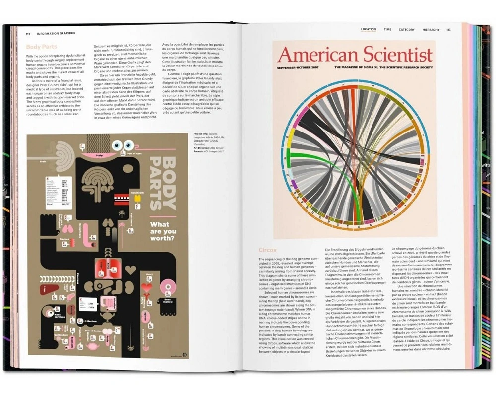
Author: Sandra Rendgen and Julius Wiedemann
Where to buy: Amazon
Best for: professionals and enthusiasts in graphic design, data visualization, journalism, communication, and information design (from beginners to experienced practitioners)
Overview:
The book has more than 400 examples of information graphics from different countries that span data visualization in journalism, politics, business, and other fields. Additionally, there are a few introductory writings on data journalism, data visualization philosophy, and history.
In data visualization, Information Graphics performs the function of an encyclopedia. Essays on historical background and practice are found in the first half. In the second half of the book, chapters organized by region, period, category, and hierarchy exhibit more than 200 projects and 400 examples of information graphics from across the world in a range of fields.
Best part of the book:
Not only is it filled with stunning and diverse examples of worldwide information graphics, the book features in-depth case studies that examine the design process behind notable information graphics projects. These case studies offer insights into the concept development, data analysis, and design decisions that went into creating successful information graphics.
Information Graphics also explores design principles and techniques specific to information graphics. It discusses topics such as visual hierarchy, color theory, typography, and layout, providing guidance on how to effectively convey complex information visually.
And much to mention, the book presents information graphics from around the world, showcasing diverse cultural influences and perspectives. This global perspective offers readers a broader understanding of the field and exposes them to different styles and approaches.
13. Knowledge is beautiful
Author: David McCandless
Where to buy: Amazon
Best for: a wide range of readers interested in data visualization, information design, and general knowledge
Overview:
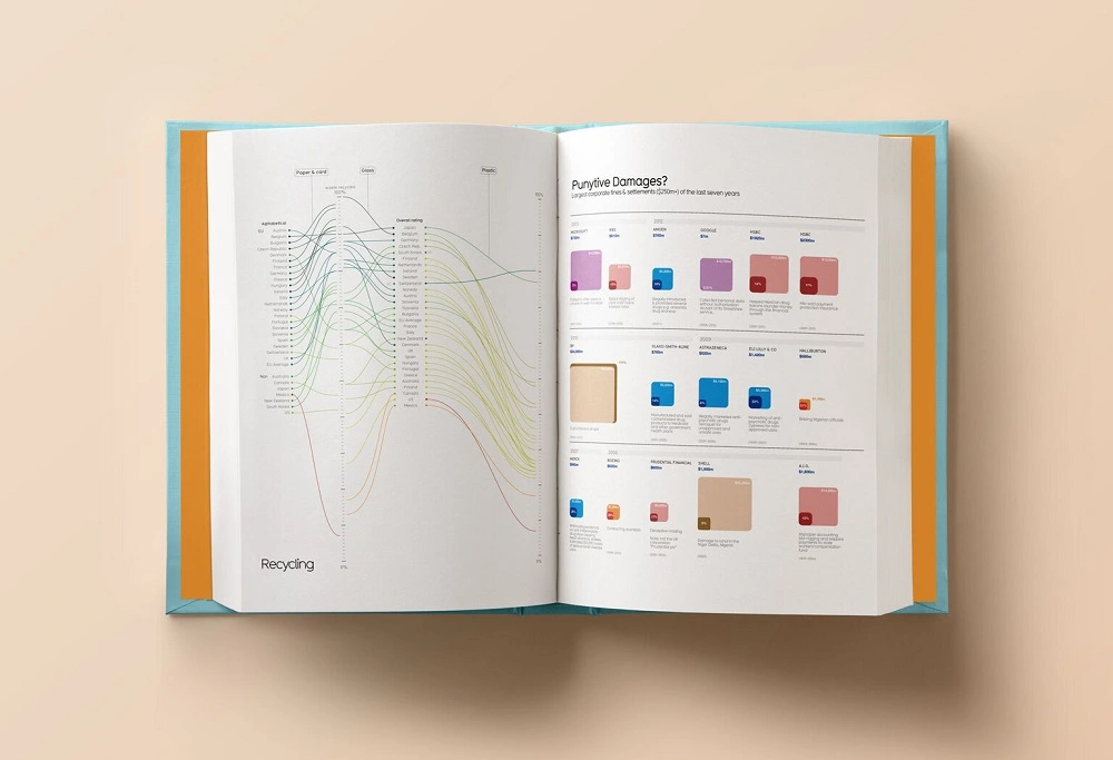
The book builds upon McCandless’ previous work, Information is Beautiful, and presents a collection of visually stunning and thought-provoking visualizations that transform complex data into accessible and engaging visual representations.
The book showcases a diverse array of topics, ranging from science and technology to society and culture. It explores datasets from various fields and presents them in visually compelling and informative ways, allowing readers to gain insights and understand complex concepts more easily.
Best part of the book:
Knowledge is Beautiful is characterized by its visually striking and aesthetically pleasing design. McCandless employs vibrant colors, elegant typography, and creative graphical elements to create engaging visualizations that captivate readers.
Each visualization in the book is accompanied by concise and informative text that provides context and explanations. This contextual narrative concept helps readers understand the significance of the data and the insights it reveals. Moreover, the book encourages readers to explore data in a visually immersive manner. It presents a wide range of datasets, allowing readers to delve into the details and uncover patterns, correlations, and connections.
Throughout the work, McCandless treats data as a form of art, using visual design principles to transform it into visually appealing and accessible representations. The book showcases the beauty of information design and the potential for data visualization to communicate complex ideas in a visually engaging way.
14. Data sketches: A journey of imagination, exploration, and beautiful data visualizations
Author: Nadieh Bremer and Shirley Wu
Where to buy: Amazon
Best for: data enthusiasts, information designers, data scientists, and anyone interested in the art and science of data visualization (from beginners to experienced practitioners)
Overview:
The book takes readers on a journey through various data visualization projects undertaken by the two authors; explores different datasets, design approaches, and storytelling techniques; and provides insights into their creative process, techniques, and the stories behind their visualizations.
Best part of the book:
Not only showcase a wide range of visualizations, each with its unique style and purpose, Data Sketches offers a glimpse into the authors’ creative process, from ideation to execution. It provides readers with insights into how they approach data exploration, design decisions, and the iterative nature of their work. At the same time, data manipulation, coding techniques, and design principles are mentioned clearly, offering valuable guidance for readers interested in implementing similar projects.
While covering many topics such as climate change, music, social media, etc., the book provides behind-the-scenes stories and anecdotes, giving readers a deeper understanding of the context, challenges, and inspirations behind each visualization. These stories add depth and personal connection to the visualizations.
Moreover, Data Sketches incorporates interactive elements, such as QR codes and online resources, allowing readers to explore the visualizations further and engage with the data on a deeper level.
15. Data visualization – A practical introduction
Author: Kieran Healy
Where to buy: Amazon
Best for: students, researchers, professionals, and anyone interested in learning about data visualization techniques and applying them in work (from beginners to experienced practitioners)
Overview:
The book covers a range of topics related to data visualization, including data exploration, data types, design principles, and the use of visualization tools. It emphasizes the importance of understanding the data and the context in which it is presented to create meaningful visualizations. From the book, readers can have the necessary tools and knowledge to present data in a clear and engaging manner.
Best part of the book:
Data Visualization takes a hands-on approach, providing practical examples and exercises throughout the book. Readers have the opportunity to apply the concepts they learn to real-world datasets, reinforcing their understanding of the principles and techniques.
The book also introduces readers to various visualization tools and libraries commonly used in the field, such as R, Python, and D3.js. It provides guidance on selecting the appropriate tool for different visualization tasks and offers code examples to demonstrate their usage.
The publication, at the same time, addresses the ethical considerations surrounding data visualization and emphasizes the importance of responsible and accurate representation of data. It also explores the role of visualization in effective data communication and storytelling.
16. How charts lie: Getting smarter about visual information
Author: Alberto Cairo
Where to buy: Amazon
Best for: a wide range of individuals interested in data visualization, critical thinking, and media literacy; for both professionals and non-experts, such as journalists, students, researchers, consumers of news and data, etc.
Overview:
How Charts Lie explores the common ways in which charts and visual representations can mislead or distort information and provides readers with the tools and knowledge to critically evaluate and interpret visual information.
The book challenges the assumption that charts are always objective and accurate representations of data. It highlights the potential pitfalls and biases inherent in visualizations and encourages readers to develop a critical eye when analyzing and interpreting visual information.
Best part of the book:
The most outstanding point is it provides readers with a toolkit to identify and deconstruct misleading or flawed visual representations. It explores various techniques used to distort information, such as improper scaling, cherry-picking data, and misleading visual design elements.
Also, the book delves into cognitive and perceptual biases that can impact how we interpret visual information. It explores concepts such as information overload, the impact of framing, and the role of preconceived notions in shaping our understanding of charts. Moreover, understanding the context in which charts are presented plays a significant role.
Interestingly, the book promotes media literacy by empowering readers to critically evaluate visual information presented in news media, advertisements, and social media. It provides practical tips and strategies to navigate the vast amount of visual information encountered in the digital age.
17. The book of circles: Visualizing spheres of knowledge
Author: Manuel Lima
Where to buy: Amazon
Best for: individuals interested in data visualization, graphic design, history, and symbolism (from beginners to experienced practitioners)
Overview:
Using examples from other civilizations, works of art, scientific discoveries, and philosophical ideas, the book highlights the significance of circles throughout history. The fundamental features and symbolism of circles are examined, as well as how they have been utilized to symbolize intricate concepts and structures.
Best part of the book:
The Book of Circles offers a historical perspective on the use of circles as a visual representation tool. It explores ancient and contemporary examples, showcasing how circles have been employed to convey information and organize knowledge throughout different periods. Together with cultural and symbolic meanings associated with circles, it explores how different cultures and belief systems have ascribed significance to circles, highlighting their universal appeal and enduring power as a visual symbol.
The book also presents a wide range of data visualizations that utilize circular forms. It showcases innovative and compelling examples that demonstrate the versatility and expressive potential of circles in visualizing complex information.
18. Effective data visualization: The right chart for the right data
Author: Stephanie Evergreen
Where to buy: Amazon
Best for: professionals, analysts, researchers, and anyone involved in presenting and communicating data (from beginners to experienced practitioners)
Overview:
Readers can find out the principles of selecting the right chart type based on the characteristics of the data being presented through this book. It emphasizes the importance of choosing visual representations that accurately and compellingly convey the intended message.
Best part of the book:
Effective Data Visualization provides readers with a framework for selecting the most appropriate chart type for different types of data. It explores various data types, including comparisons, distributions, relationships, and compositions, and offers guidance on matching them with suitable chart options.
The book also addresses the importance of accessibility in data visualization, offering guidance on creating visualizations that are inclusive and usable by a wide range of audiences, and discussing the role of interactivity in enhancing user engagement and exploration of data.
19. Better data visualizations: A guide for scholars, researchers, and wonks
Author: Jonathan Schwabish
Where to buy: Amazon
Best for: individuals interested data field
Overview:
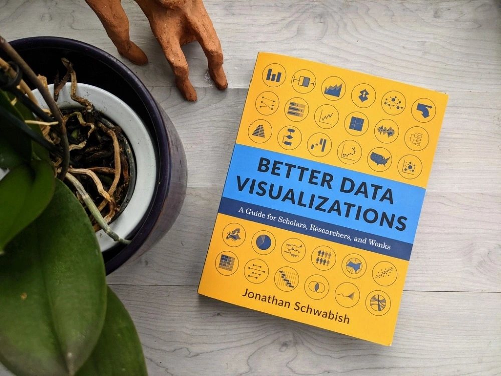
This book outlines key techniques for producing data visualizations that are more effective. Readers are guided through the process of making better graphs and learning how to go beyond basic lines, bars, pie charts, and more. This book will help you establish your audience and objectives, select the graph that best represents your data, and convey your point of view.
Best part of the book:
The author illustrates the dos and don’ts of data visualization, the fundamentals of visual perception, and how to make arbitrary stylistic judgments on a chart’s design using more than five hundred examples. From histograms to horizon charts, ridgeline plots to choropleth maps, Schwabish also examines more than eighty different visualization forms and explains how each fits into the visual toolbox.
20. Data visualisation: A handbook for data driven design
Author: Andy Kirk
Where to buy: Amazon
Best for: professionals, designers, analysts, and anyone interested in effectively communicating data through visual means (from beginners to experienced practitioners)
Overview:
The book serves as a comprehensive guide to the principles, techniques, and best practices of data visualization. It covers these main points as principles of data visualization with its process, a variety of visualization techniques, numerous case studies and examples from real-world projects, ethical and responsible data visualization, etc.
Best part of the book:
The best parts of the book include its comprehensive coverage of data visualization principles and techniques, practical guidance on the data visualization process, and the inclusion of real-world case studies that offer valuable insights into effective design choices. Additionally, the book is known for its clear and engaging writing style, making complex concepts accessible to readers.
21. Visualize this: The flowing data guide to design, visualization, and statistics
Author: Nathan Yau
Where to buy: Amazon
Best for: data analysts, researchers, journalists, designers, and anyone interested in data visualization (from beginners to intermediate-level practitioners)
Overview:
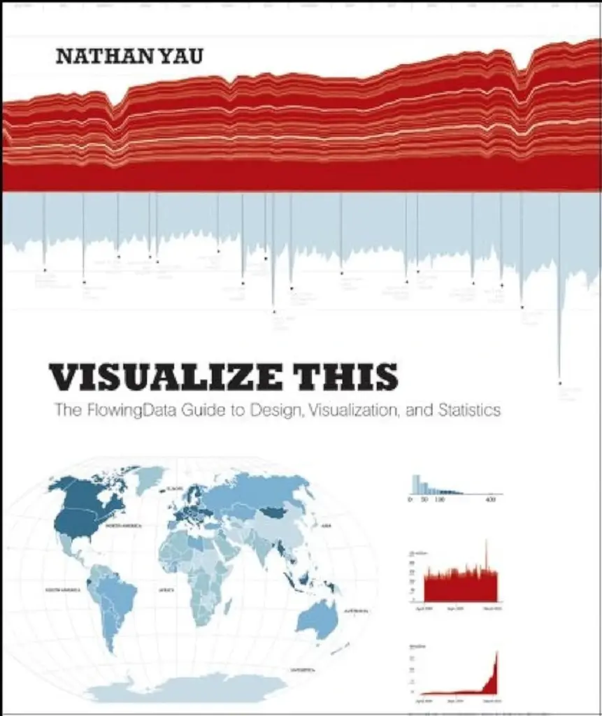
The book provides a holistic approach to data visualization, covering concepts from data exploration and cleaning to design principles and statistical analysis. Readers can see the importance of aesthetics, design principles, and effective storytelling in creating impactful visualizations.
With real-world examples and case studies, this publication illustrates how data visualizations have been used to solve problems and communicate complex information effectively.
Best part of the book:
One of the notable strengths of the book is the inclusion of step-by-step tutorials and code examples. Readers can follow along with the instructions to implement the visualization techniques using popular tools, gaining practical experience and confidence.
Visualize This also integrates statistical concepts and data analysis techniques into the visualization process. This aspect helps readers analyze and interpret data effectively, leading to insightful visualizations that communicate statistical findings.
22. Cartographies of time: A history of the timeline
Author: Daniel Rosenberg and Anthony Grafton
Where to buy: Amazon
Best for: scholars, researchers, designers, historians, and anyone interested in data visualization
Overview:
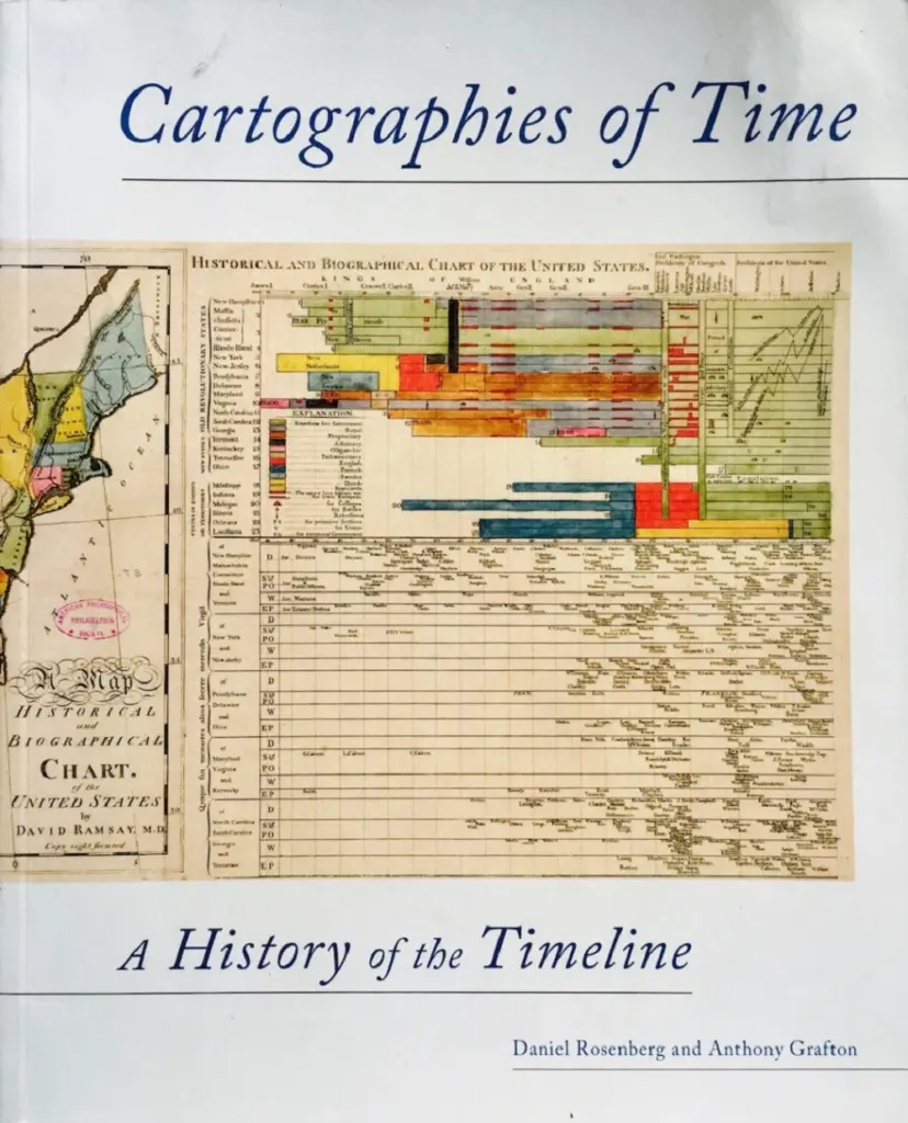
The book focuses on how time has been represented graphically, which has been a tremendous undertaking. It’s intriguing and shows how comparable the difficulties in data visualization that we face now are to those that existed hundreds of years ago.
Cartographies of Time provides a thorough description of the attempts made by Western civilization to create graphic timelines throughout history. The book includes images and provides a visual timeline of time in Europe and North America spanning over 600 years.
Best part of the book:
Readers might love the way it provides an extensive historical overview, tracing the development of timelines from ancient civilizations to the present day. It explores various cultural, artistic, and scientific influences that shaped timelines throughout different time periods.
Meanwhile, the book features a rich collection of illustrations, including historical timelines, maps, diagrams, and other visual artifacts. These visuals enhance the reading experience and provide readers with a visual understanding of the concepts discussed.
Cartographies of Time goes beyond the technical aspects of timelines and delves into the cultural, social, and intellectual contexts in which they emerged. It explores how timelines reflect and shape our understanding of time and history. Moreover, the book draws from various disciplines, including history, art, cartography, and science, to provide a well-rounded exploration of timelines. This interdisciplinary approach offers readers a broader perspective on the subject.
23. Semiology of graphics: Diagrams, Networks, Maps
Author: Jacques Bertin
Where to buy: Amazon
Best for: data visualization practitioners, researchers, academics, and students in the field of data visualization, information design, or visual communication
Overview:
Semiology of Graphics presents a comprehensive framework for understanding and creating effective visual representations of data. The book introduces the concept of semiotics, which focuses on the study of signs and how they convey meaning. Bertin applies semiotic principles to the field of graphics, exploring the fundamental elements and rules that govern the visual representation of data.
Best part of the book:
The author identifies graphical elements, such as shape, size, color, and position, which can be used to encode data. He discusses how these visual variables can be applied to different types of data and how they impact the interpretation of visualizations. The book explores various graphical primitives, such as points, lines, areas, and volumes, and their application in creating different types of charts, maps, and diagrams.
Moreover, Bertin addresses the role of interaction and animation in enhancing the understanding and exploration of visualizations. He discusses techniques for navigating, filtering, and manipulating visual representations.
24. Visual thinking for design
Author: Colin Ware
Where to buy: Amazon
Best for: designers, students, professionals in related fields like marketing, advertising, and communication
Overview:
This book is fantastic for anyone interested in the science underlying data visualization and wants to become a better visualization designer.
In order to successfully express your message, you may use data visualization. This book explores the science and psychology underlying design. It depicts design as more of a tool that uses certain methods to benefit from how the brain perceives and thinks. It has full-color illustrations and hundreds of textual examples.
Best part of the book:
One of the standout features of the book is its exploration of cognitive and perceptual principles and how they relate to design. Colin Ware delves into topics such as visual attention, pattern recognition, and visual memory, providing designers with a deeper understanding of how users perceive and interpret visual information.
Including numerous visual examples and illustrations, the book helps readers grasp the concepts more easily and provides real-world instances of how visual thinking principles have been applied successfully in design.
At the same time, with specific design case studies that exemplify the application of visual thinking principles in real-world design projects, readers might get useful insights from them and demonstrate how visual thinking can contribute to successful design outcomes.
Wrapping up
Whether you’re seeking to enhance your professional capabilities, impress your audience, or simply broaden your knowledge, these data visualization books are definitely the ultimate resource to fuel your data visualization journey. By diving into the knowledge, you will acquire the skills necessary to create visually stunning and informative representations of data.
And If you want to get better at your work, or need help unlocking the power of data visualization with practical solutions for your own business, contact Synodus immediately for a consultancy.
Happy reading and exploring the world of data visualization!
How useful was this post?
Click on a star to rate it!
Average rating / 5. Vote count:
No votes so far! Be the first to rate this post.


